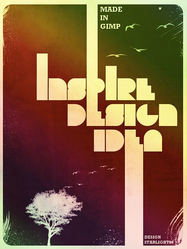
After a few tests to find the right colors and idea, i've created a typography design for this tutorial.The design is inspired by the amazing work of Scott Hansen.If you don't know who he is, I highly recommend you to check his work out. Click HERE.
Before we start this tutorial,let's take a look at the image we'll be creating.You can view the final image preview below or view a larger version HERE.
In this tutorial, I will show you how to create a typography design poster. We will learn how to make some elements look a bit dirty, adding textures to the design, and add some depths using light effects.
DOWNLOAD THEM
For this project I will use :
Font: Bifurk
Brush: Dirty spraypaint brush, Bird brush, Tree brush and Bittbox watercolour brush.(Paste the brush to your gimp folder)
And i'm using Gimp 2.6 for this tutorial.
Start a new Gimp Document, The size I chose for the tutorial is 768 pixels by 1024 pixels. Fill the background with color #f3e9b8
Next, create new layer and draw a rectangle shape with the shape tool, as in the image below.
We will create a nice rounded rectangle for this one. So go to Select>Rounded Rectangle and i use 10 radius.Click OK.
Fill the rectangle with dark brown #412011.
Next you need to create some text. For the typeface I used a nice font called Bifurk. Select the Type Tool,the size is 100 px and type DESIGN.
Create a new layer.Now make a rectangle shape above the E letter. and then fill it with the same color of our background ( #f3e9b8). Click image for larger view.
Create another text. This time i use the word IDEA. Put the text behind the DESIGN text.
create another rectangle shapes like the image below.
Once again select the Type Tool (T) and type INSPIRE. Put it above the DESIGN text. The main idea here is make the the text combine with the rectangular. That's why I placed them over the E and a bit on the P.
Create another layer and be creative. Add more shape to the text.
After that,merge down all the text and rectangle layer to a single layer. see the image below.(to merge right click at layer palet and select merge down)
Create a new layer.I use the Dirty Spraypaint and the Bittbox Watercolour brushes to give a little texture to the design.This helps add a little texture feel rather than a flat area. For the color i use #f3e9b8.
The next steps is adding bird and the tree..Create a new layer and select bird brush and start painting.
Next, create a new layer and painting tree.
add more bird..
Now let's add a paper texture from deviant art, you can download it HERE. Move the texture into your document. Put the texture layer on the top of other layer.
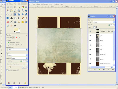
Rotate the texture using Rotate tool.
You'll see that the texture is smaller than our canvas size so we will resize it using the Scale tool. Dont forget to tick the keep aspect box.
Change the mod layer to Overlay.
Create a new layer and named it as gradient. The layer must be behind the texture.Using the gardient tools select Full Saturation Spectrum Gradient , 100 for the opacity and Linear for the shape. Change the layer mod to Grain extract.The opacity is 24.8. Click the image for larger view.
Now add some depth to the design. Create a new layer and fill it with black.Go to Filters > Light and Shadows> Lighting effects.Use the values in the pictures. Click for larger view.
Change the opacity to 50 and the layer mod to Overlay. Finish. :)
Conclusion
If you want to create a version with a brown/darker color you will have to change the gradient. Instead of using the full saturation spectrum gradient, use german flag smooth gradient. It's just a simple and nice tecnique, inspired, again, by the incredible work of Scott Hansen.
Final result
Another version( using german flag smooth gradient color)
ENJOY AND CHEERS!
I also included the Xcf file.
Click here to download the Xcf file used for this tutorial
Cool Typography Design Poster in Gimp
Posted by Starlight86 | gimp tutorials
Leave Me Comment! Click Here(49) | 4:17 AM


49 Responses to "Cool Typography Design Poster in Gimp"
two thumbs up! I definitely like the easy steps you've done. great piece of work.
I absolutely love this one! I'm definately going to try this one out some time. Welcome back btw ^.^ it was a rather boring week for me since you didnt update your blog :P
Good Job man...
i tried to do it with photoshop
Nice tutorial i would have done it but i can not download the font for some odd reason
@ feathervane and rik.
tq for the comment..:) and thanks for visiting this blog..
@ salmen..would love to see the result in photoshop..:)
@ brandonel..
thanks..if u need some help,email me..
@ Putera Aladin...http://flickr.com/photos/salmen/3057602730/
wow..that is very nice and stunning..i love it..:D
Your showing some great talent bro! keep it up :)
thank you Gimper :)
my computer is jacked up so i can only see 3 pictures of the tutorial :( But the finished product looks amazing! nice work
@jerry subscribe to my feedburner/or u can add it to google reader..maybe u can read it through feed/google reader if you can't see the image from my blog..
That's amazing! Thanks so much for sharing!
welcome
Hey, thanks for the tutorial! I changed it a little to make an e-christmas card - I think it worked pretty well!
http://i416.photobucket.com/albums/pp241/joanne_pickard/christmas.jpg
@Jo P
wow..awesome work!
:D
Man, this is probably the best Gimp tutorial I have seen so far, keep writing more!
sure, i'll write more Gimp tutorials at my blog..so stay tuned and thanks for your comment..cheers :D
All I can say is... More, more, more GIMP power tutorials. Thanks for the inspiration Putera.
How do u download the font?
Ok i finally got it...TOTALLY NOT A WASTE OF TIME OMG IT IS SOOO COOL THX ALOT :)
Made an attempt. Didn't really follow the steps- just looked at the pic and decided to have a go at it.
http://flytape8490.deviantart.com/art/Inspire-Design-107393956
:) nice idea
Nice tut...i'mma do this :)
Yeah, you said to download those brushes right, but to do it in GIMP? I saved them and they where Photoshop brushes. Wtf?
yeaa..they are photoshop brush..put them in gimp folder and you can used them as Gimp can read abr file 2..(this is advantage of Gimp because it can used photoshop brush meanwhile photoshop can't used Gimp brush)
This is the most inspiring Gimp blog i have seen. Thanks alot for all your work and insights so far. Keep it up!
welcome and thanks for visiting this blog :)
Just finished my version...
it's the first design in my life..
learned and enjoyed...
thanks a lot
eman D.
awsome
Thanks so much for this tutorial!
You covered using a lot of tools and effects that I've been wondering about using in GIMP - but haven't really gotten to messing around with yet.
Simple, effective, and fantastic looking...
@ eman D.
Glad you like it. :)
@ erissiva
Thanks for the comment..Cheers :)
Thanks! This is a super easy tutorial that produces amazing results.
Here's an example of mine here.
http://www.flickr.com/photos/29106306@N02/3349782741/
wow..awesome result.congrat..:)
Great tutorial, it was really easy and the result was identical! Thanks!
welcome..thanks for visiting this blog :)
that kicks butt, great tutorial (though i also use gimp 2.6 and that font wasn't on there and the Bittbox watercolour wasn't supported when i put it in the brush section of gimp) though i did try my best to deliver. thanks again and here's what mine looks like (its a sig for a forum) - http://i324.photobucket.com/albums/k324/klonex123/SKyRangers.jpg anyway thanks again i hope you make lots more
that tight.... really cool
THANK YOU!!!!!
thanks, great tutorial! i'm kind of a hack when it comes to graphic design, and i prefer tutorials like these that give you a broad understanding of a variety of techniques instead of just one idea (though i'm sure that's beneficial for more advanced users.) thanks again, sam.
I like the tutorial but I can't find the font please cane anyone send me the font
mij E-mail = ijsmat@live.nl
thank you
i have make my own wich a other font
[url]http://i44.tinypic.com/2i23o0g.jpg[/url]
i already commented and told you how much i appreciated this tutorial. here's some stuff that i've been able to do:
http://sambk.com/2009/06/11/the-gimp/
I Cant get the font? It is not on dafont :S
http://www.acidfonts.com/freefonts/bifurk.htm ;D
Hello Hafidz,
I sure like your gimp tutorials: Cool Typography Design Poster in Gimp!!!
my question: Can I translate the tutorials too Polish? (For our Polish GIMP community http://www.gimpuj.info/index.php)
I would include your name and a link to your blog.
Thank you and Regards,
drewish
yes you can translate the tut..make sure link back to this blog. tq
Great tutorial! I have developed a site dedicated to collage and mixed media art. There is some cool stuff on there. You can check it out at http://www.kohlage.com.
@TTDaVeTT i have checked ur site and i love ur blog. very cool. if u dont mind, i would like to feature your site on my post blog.
Thank you! This has helped my overall use of gimp and I used this to make a holiday card (with variations of course) Great tutorial though I got confused a few times (my fault not yours) ^^
Post a Comment
Type your comment here, I'll try my best, to reply!